"the process of putting a decision or plan into effect; execution"
The colour black is associated with strength and authority. As it says in one of the highlighted points, "black diminishes readability", however I don't agree with this as I feel that in my case the black colour emphasis the other colours and makes them stand out.
Black is a simple colour to work it, therefore is used by professional websites such as Hollister. Looking at other websites, including Hollister, made me decide that I want to use black as the main colour of my backgroud to make my website look professional and in this case to make the readability easy.
I decided to use a colour scheme of three colorus for my background so that is eye catching but it don't distract the users from the text.
Another chosen colour was blue as it linked to 'intellect' and dark blue is associated with 'depth'. I wanted these features to come across to my users when navigating my website.
I really like the white and blue combination of colours, this is another reason for why I chose these colorus.
Blue is also a vibrant colour which is associated with calmness and in my opinion this is very important as I don't want that the colors I chose to be to bright, making it hard to read.
To start this project off I first looked at colours connotations on the internet and based on that I chosen the colors I want to incorporate in my website in order to reflect my personality.
I took some screen shots of my chosen colours and their connotations then used Photoshop to emphasize the points that are relevant to my website.
One of my chosen colors was white as it symbolizes simplicity and is the color on perfection which highlights my personality as I am a perfectionist .
I also found that white is a common color used by professional websites such as Virgin Media. It is also easy to work with as is a neutral colour and stands out on dark color backgrounds.
On the right side of the page is the colour scheme for my entire website including text boxes, text and pictures.
I feel like the colours I chose really go together. To comply with my chosen colour scheme, my background picture has the colours black, white and blue within. The consistency of the colours used provides coherence and structure throughout my site.
I created a video to show my work process using QuickTime to record and the "compare revision to this page" function which takes you back from where you started.
in the video on the right side of the page is shown how I created my "Mobile App Development" page. The background chosen was taken off google as it conforms to the color scheme that I wanted. Initially I chosen two different background images but then decided to change them as the bright colors diminished the readability of my text.
I then made the buttons by using "make this object appear to all pages" function which duplicated the buttons I did for my homepage. I decided to highlight my buttons by adding a text box underneath each one of them to make by website look better and more professional. The buttons are white and blue even though initially they were all white I felt like there was too much white on the page.
I feel that the font I chosen goes with the theme of the website as it is easy and simple to read. I decided that the buttons I had on my homepage will be placed in all my other pages in order to make the navigation simple. On the top left side of my website
I included a box which summaries what the focus of the actual page is. I added some pictures in every box to make it look better as I felt like it was looking boring without any pictures.
All my pages have the same structure and layout which is shown in the video that I put together as the pictures chosen, the text and text boxes are all in the same place.
Implementation definition
Oxford dictionary
While putting my website together I experienced difficulties and problems using hotglue. One of them is shown in the video on the right hand side of the page. As you can see the images that I've put by the subtitle disappeared once I unable the editing mode.
I did not manage to fix the problem therefore it interfered and restricted the visual side of my website. However I was lucky that this is the only case I had problems like this as on the other pages everything seemed to work just fine.
Other problems with hotglue were that there are not many font styles to chose from. This can have an impact on the overview of the website.
I also found that uploading videos on hotglue is time-consuming, especially if you made a video yourself, as it has to be uploaded to Yoututbe first, because hotglue only supports youtube and vimeo videos.
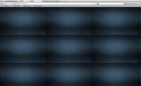
Finding the perfect background was also a time-consuming task as I had to find a large picture otherwise hotglue would make the same picture appear multiple times on the page like you can see on the right.
I did enjoy working with hotglue as it is really simple and easy to use. Although there are quite a few restrictions I think that the outcome of my project is done at a high standard and looks professional.
I found that the restrictions on hotglue are good in one way as it challanges you to find another way to do it which most of the time turns out to be simpler than the initial way.
Portfolio Design
Personal Branding
Introduction to HotGlue
Mobile Development
Home
Portfolio Implementation